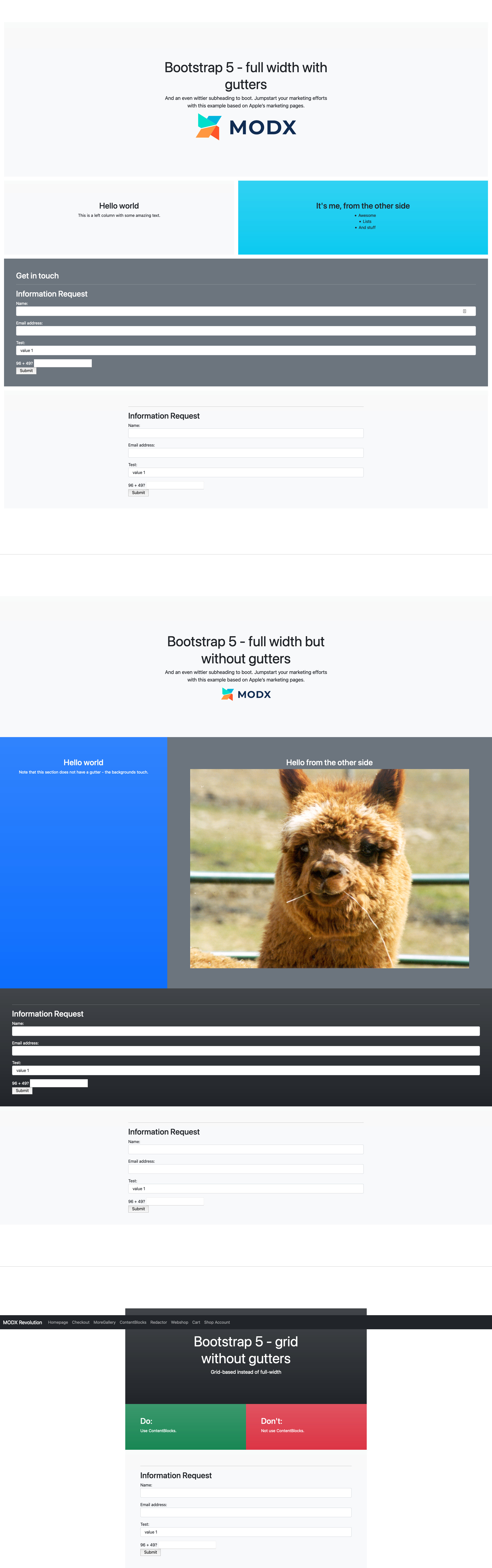
The default layout set in ContentBlocks is still for Bootstrap 3. Here’s a quick set of layouts for Bootstrap 5 in 3 styles:
- full width with gutters (full width, 1 column, 2 columns, hero)
- full width without gutters (full width, 1 column, 2 columns, hero)
- grid container without gutters (1 column, 2 columns, hero)
cbLayout_modx-revolution_2021-02-21@11-11-25.xml (18.8 KB)
Kitchen sink example:
Example MODX template with very basic sticky navbar and loading the 5.0.0-beta2 from CDN:
<!doctype html>
<html lang="en">
<head>
    <title>[[*pagetitle]] - [[++site_name]]</title>
    <base href="[[!++site_url]]" />
    <meta charset="[[++modx_charset]]" />
    <meta http-equiv="X-UA-Compatible" content="IE=edge">
    <meta name="viewport" content="width=device-width, initial-scale=1, maximum-scale=1" />

    <link href="https://cdn.jsdelivr.net/npm/bootstrap@5.0.0-beta2/dist/css/bootstrap.min.css" rel="stylesheet" integrity="sha384-BmbxuPwQa2lc/FVzBcNJ7UAyJxM6wuqIj61tLrc4wSX0szH/Ev+nYRRuWlolflfl" crossorigin="anonymous">

    <style>
        .container {
            max-width: 960px;
        }
        img {
            max-width: 100%;
        }

        /*
         * Custom translucent site header
         */

        .site-header {
            background-color: rgba(0, 0, 0, .85);
            -webkit-backdrop-filter: saturate(180%) blur(20px);
            backdrop-filter: saturate(180%) blur(20px);
        }
        .site-header a {
            color: #8e8e8e;
            transition: color .15s ease-in-out;
        }
        .site-header a:hover {
            color: #fff;
            text-decoration: none;
        }
    </style>
</head>
<body style="padding-top: 4.5rem;">

<nav class="navbar navbar-expand-md navbar-dark fixed-top bg-dark site-header">
  <div class="container-fluid">
    <a class="navbar-brand" href="[[~[[++site_start]]]]">[[++site_name]]</a>
    <button class="navbar-toggler" type="button" data-bs-toggle="collapse" data-bs-target="#navbarCollapse" aria-controls="navbarCollapse" aria-expanded="false" aria-label="Toggle navigation">
      <span class="navbar-toggler-icon"></span>
    </button>
    <div class="collapse navbar-collapse" id="navbarCollapse">
        [[pdoMenu?
            &parents=`0`
            &outerClass=`navbar-nav me-auto mb-2 mb-md-0"`
            &tpl=`@INLINE <li class="nav-item">
                <a class="nav-link [[+classes]]" href="[[+link]]">[[+menutitle]]</a>
            </li>`
            &level=`1`
        ]]
    </div>
  </div>
</nav>

<main>
    [[*content]]
</main>

<!--<script src="https://cdn.jsdelivr.net/npm/bootstrap@5.0.0-beta2/dist/js/bootstrap.bundle.min.js" integrity="sha384-b5kHyXgcpbZJO/tY9Ul7kGkf1S0CWuKcCD38l8YkeH8z8QjE0GmW1gYU5S9FOnJ0" crossorigin="anonymous" async defer></script>-->

</body>
</html>